YP Mobile App
Problem: YP decided on a brand changes and wanted to update the YP app accordingly with these changes. Stakeholders also wanted to give the users a way to be more deeply engaged.
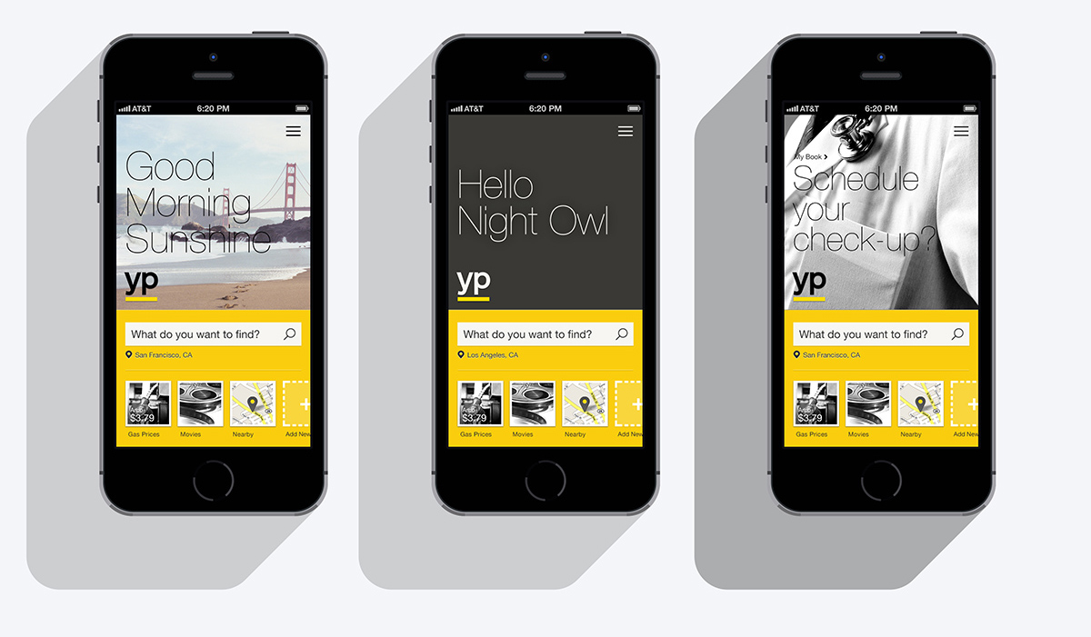
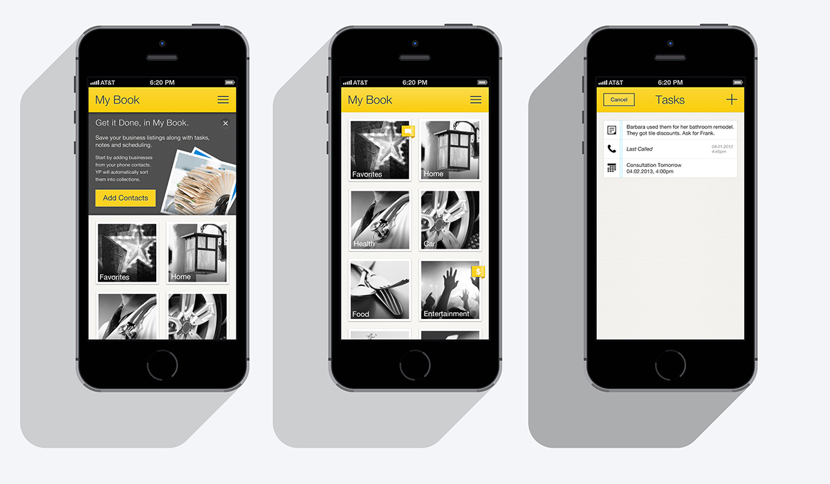
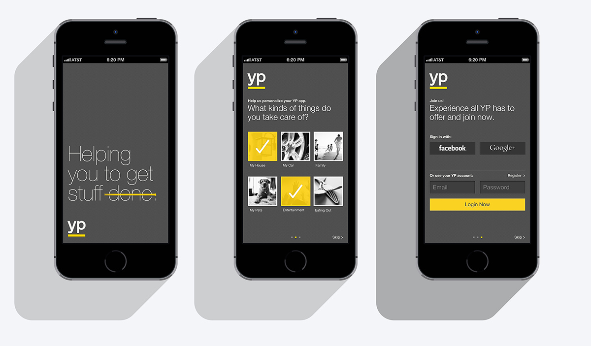
What we did: A lot of focus went into the imagery. Using large black and white images with a large, aesthetically pleasing font of helvetica neue thin for the large messaging. A section was added called My Book. Which would allow users to create tasks based on searches or interaction with businesses. As well as save their most used businesses.
Result: Focus groups in the usability tests favored the new design and easier flow to search and save businesses. It followed the new brand guidelines and had much positive feedback.